
Judy Gula, Fiber & Mixed Media Artist
Judy Gula, Fiber & Mixed Media Artist
Fiber and Mixed Media Art Supplies, Projects and Inspiration
 Email Judy Gula or learn more about contacting Artistic Artifacts.
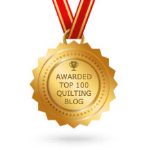
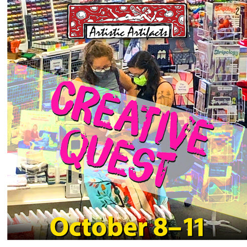
Artistic Artifacts has been selected by Feedspot as one of the Top 100 Quilting Blogs!
Categories
Blogroll
Popular posts

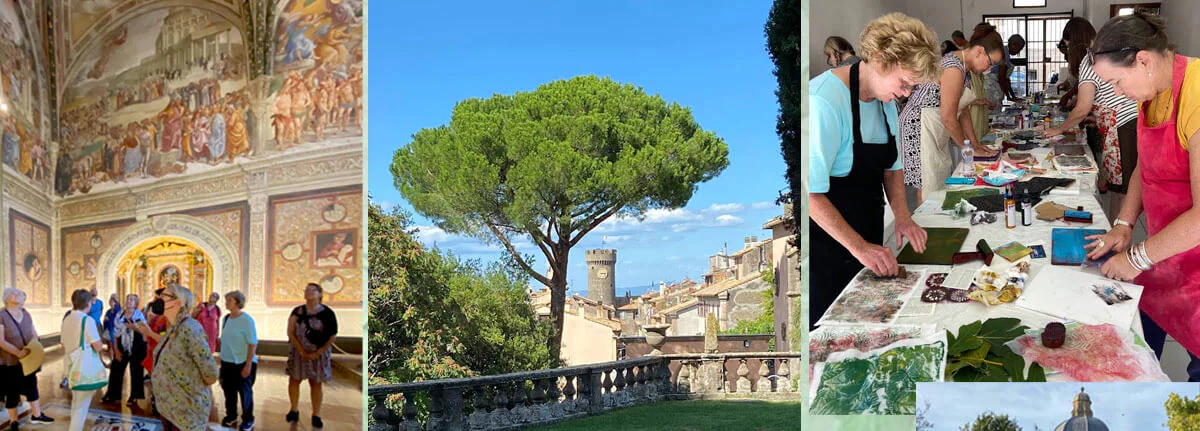
Explore the World with Judy!
During an Artistic Artifacts Travel Creative Retreat with Judy Gula, enjoy a vacation filled with art classes, tours, wonderful cuisine and more!